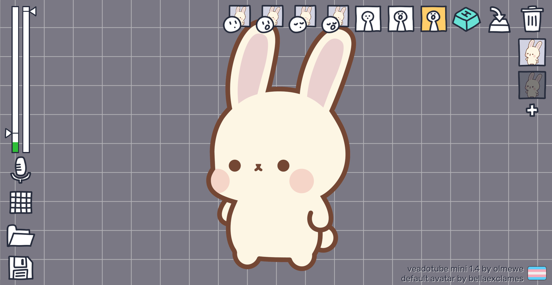
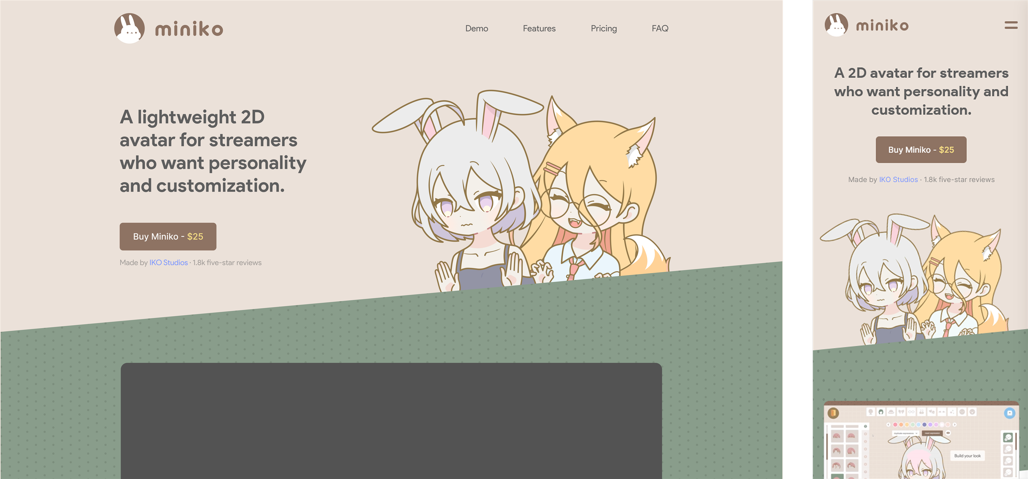
Miniko is a desktop application that lets creators build, customize, and rig expressive 2D streaming avatars without commissioning an artist or wrestling with rigging software. I lead the product design end to end, from the core creation flow to the visual system and motion.
- Role
- Owner and Product Designer
- Timeline
- 2024 — Now
- Tools
- Figma, Illustrator, Tauri, After Effects
The problem
Creating a streaming avatar is normally expensive, slow, and technical. Most creators either pay hundreds to thousands for a commission or skip avatars entirely. Miniko removes the middleman, allowing you to pick parts, customize, and go live within seconds.

Exploration
I started with the flow, not the screens. I mapped the path a creator takes to go live, then referenced existing avatar programs to define Miniko's structure and the features it needed at a minimum.

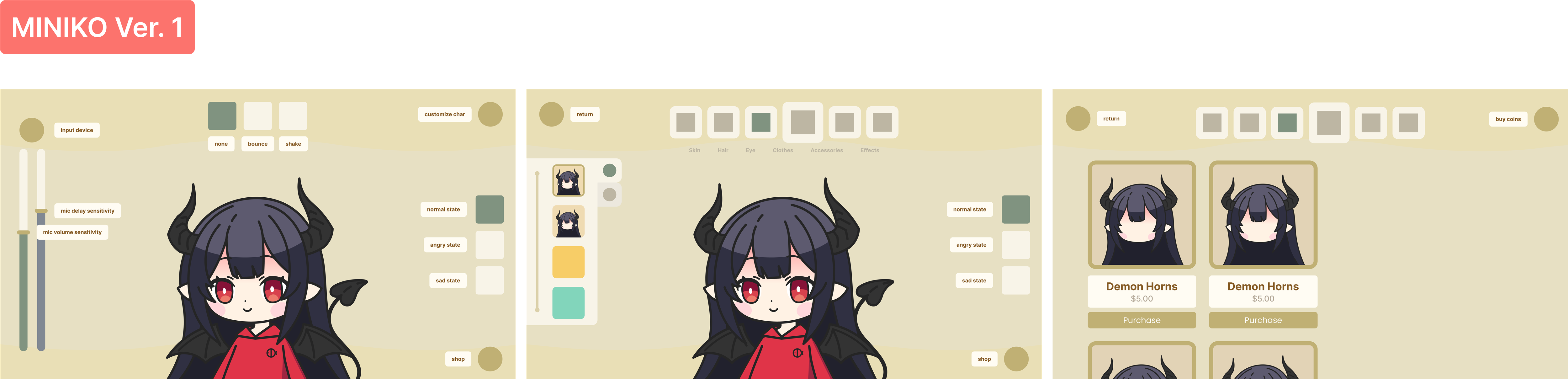
During exploration I mocked up everything: control schemes, color systems, an in-app store, icon sets. So many ideas pulled me in different directions. I kept telling myself I was protecting the simplicity, but with this much creative freedom, it was easy to get carried away.
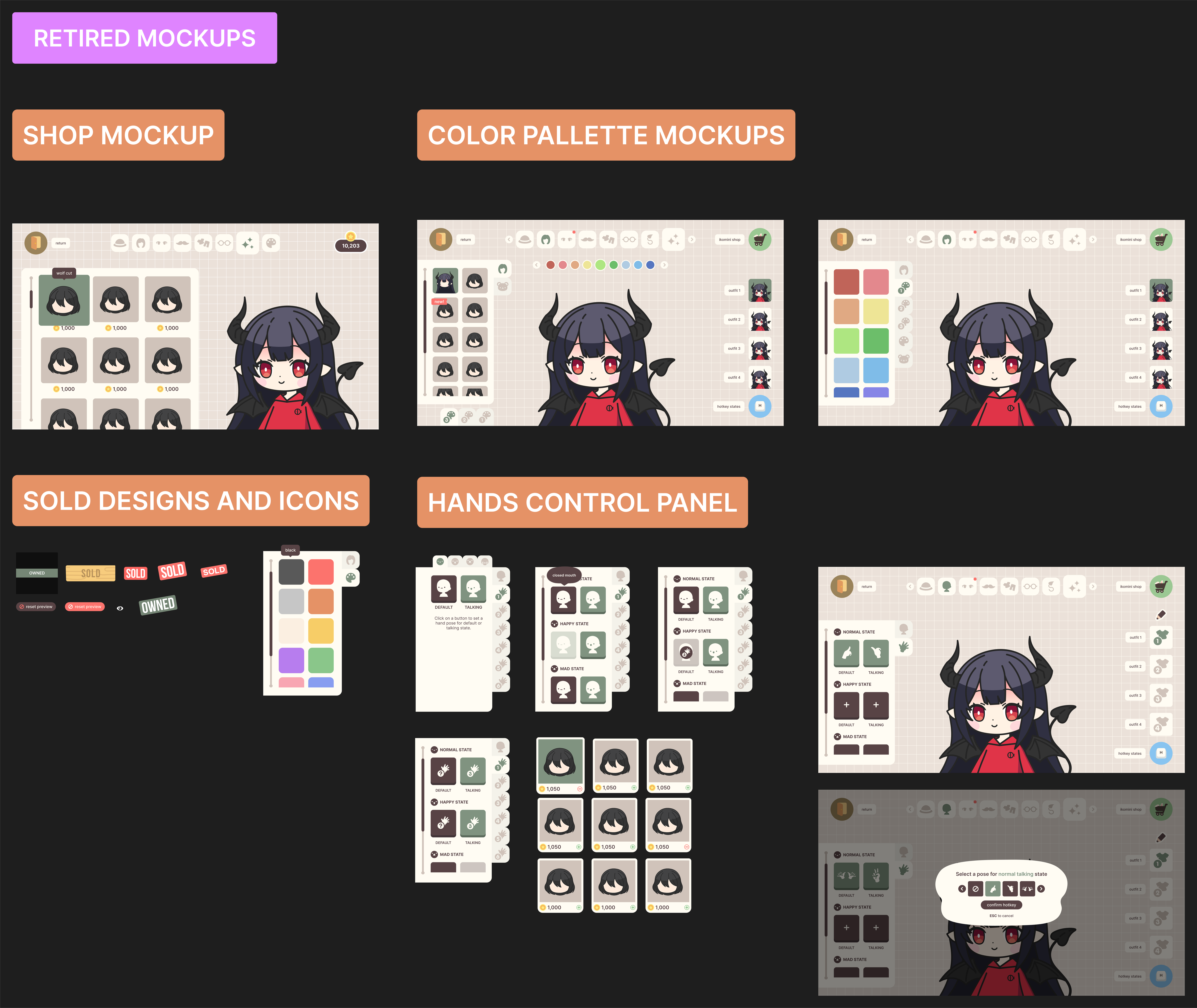
I shipped a version — then pulled it
I launched a version of Miniko on Steam, and then pulled it. The app had gotten too complex because I'd built it store-first. That one decision created too much navigation for users to wade through (coin shop, purchase prompts, dozens of states), until making a simple avatar no longer felt simple.
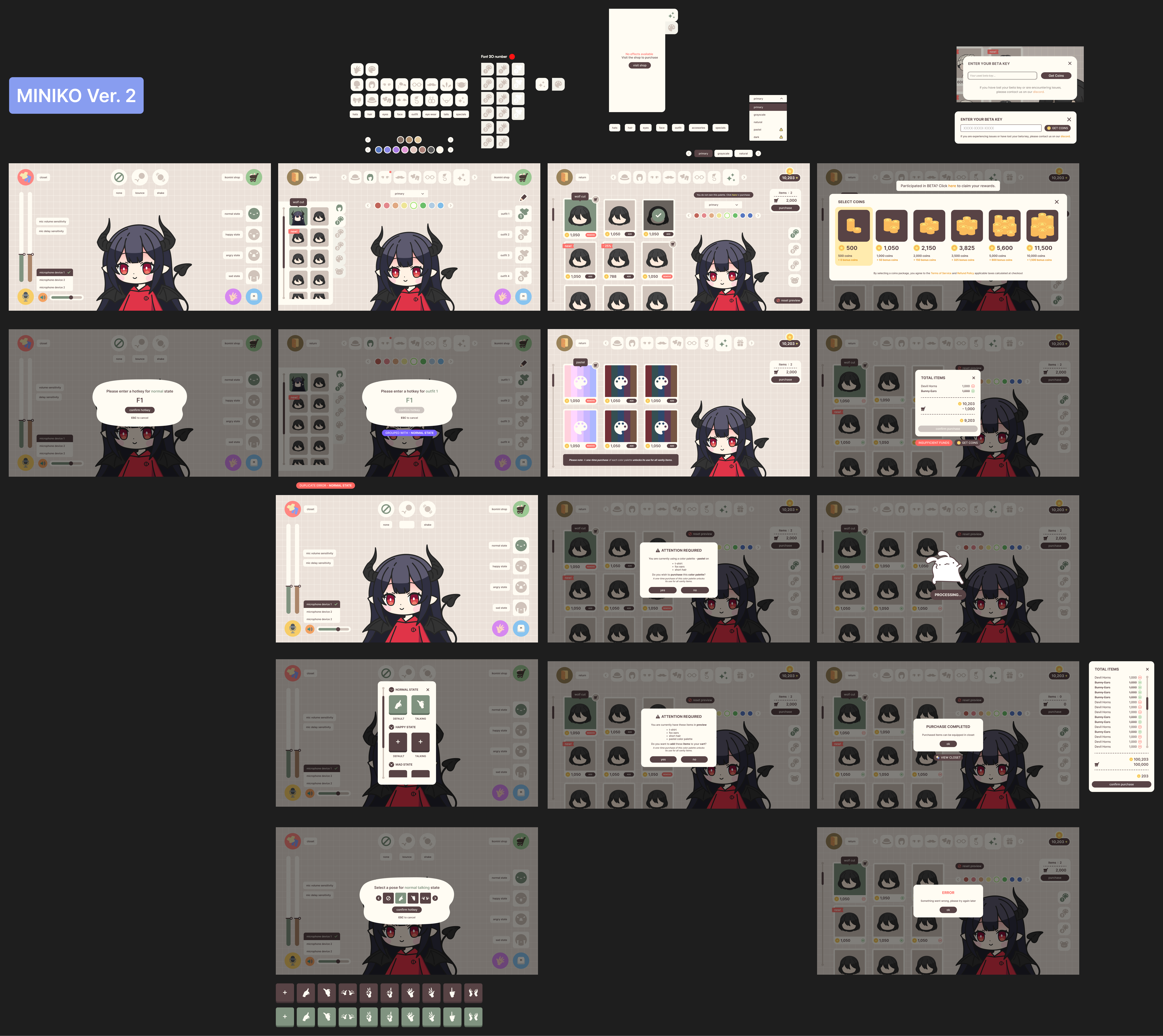
Simplicity was the valuable lesson taught here. I'd been too focused on how the design worked around the software's pricing and the features I wanted to implement. So I went back to the drawing board and started from ground zero, cutting back every unnecessary feature with the core idea in mind: a simple focused editor.
A single, focused creation flow
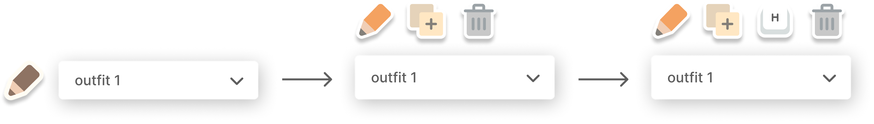
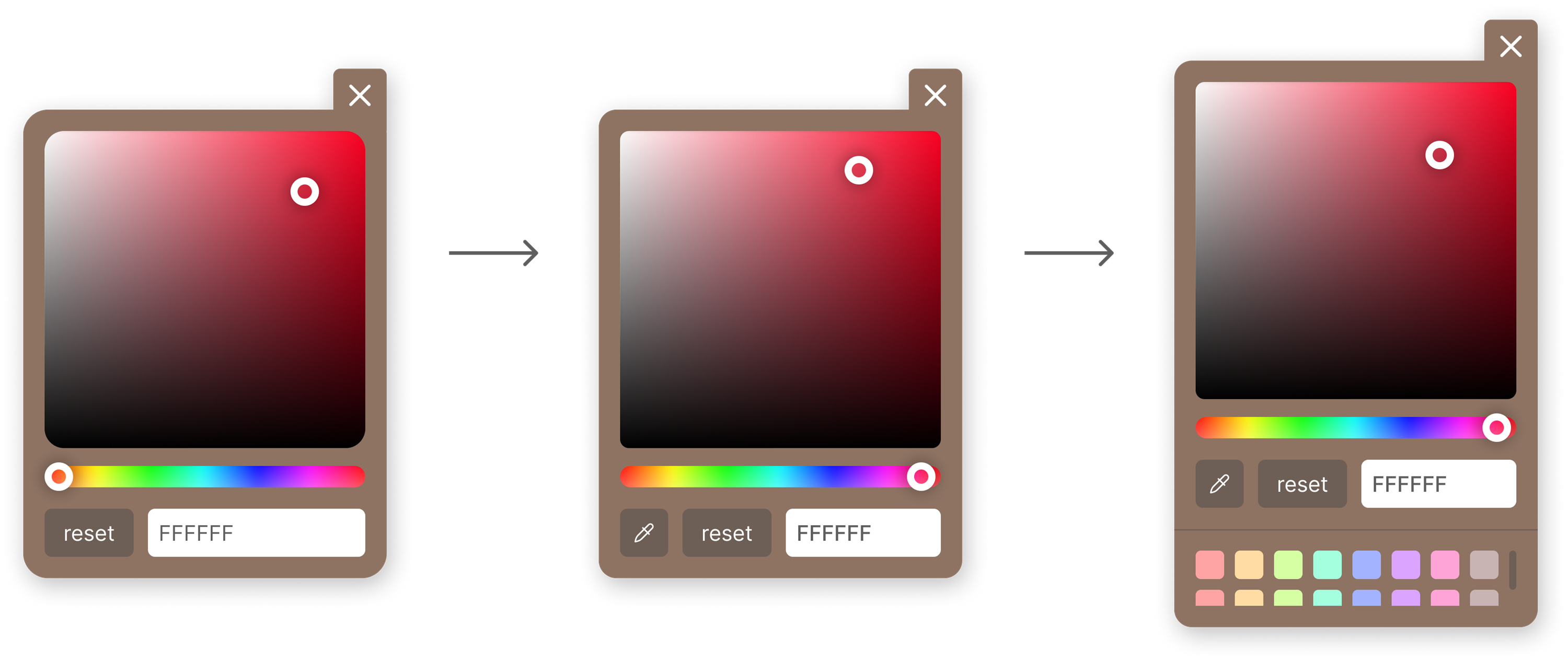
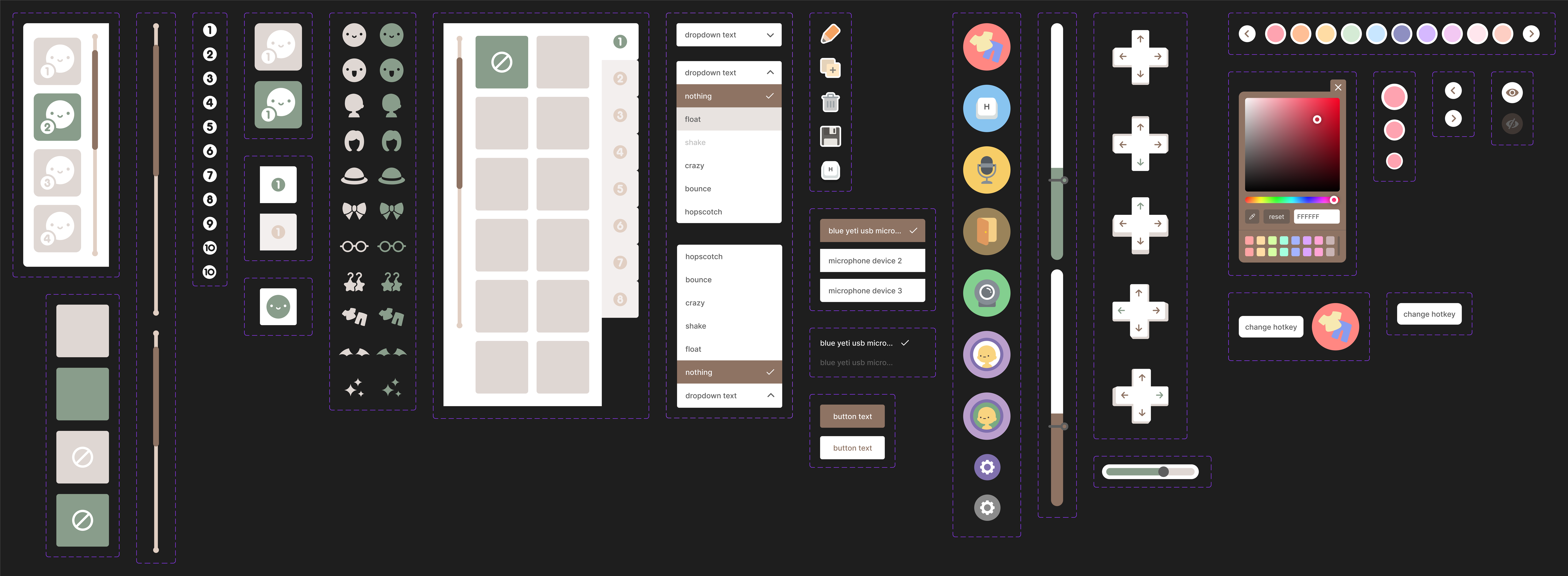
At this point, Miniko's customization was scattered: a complex editor, an overwhelming in-app shop, and fragmented controls. Feedback from my Discord community and Steam made one thing clear, creators wanted every asset available up front. So I collapsed it all into one cohesive editor with fewer interactions, less clutter, and smoother transitions between outfits, colors, and states.
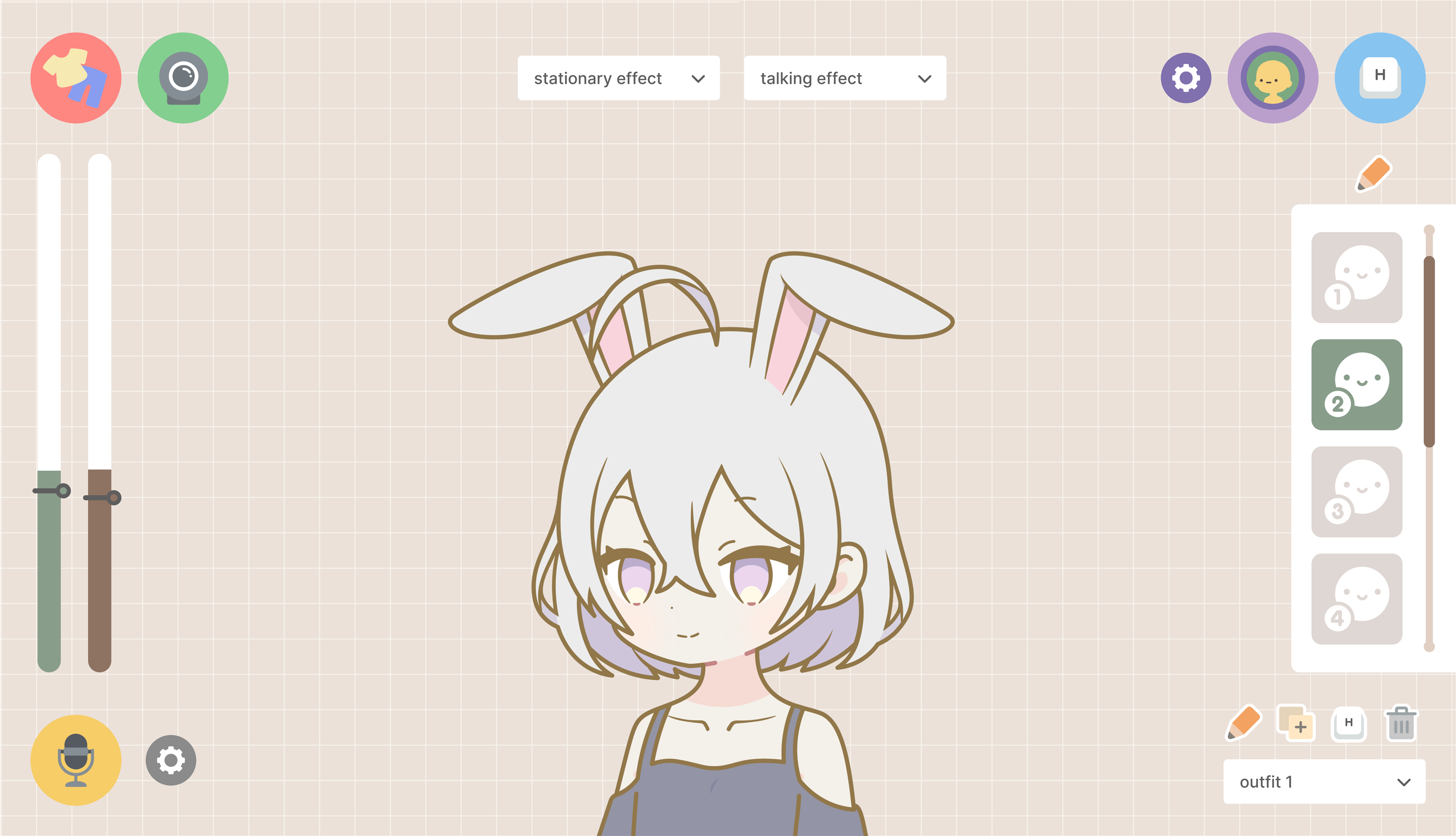
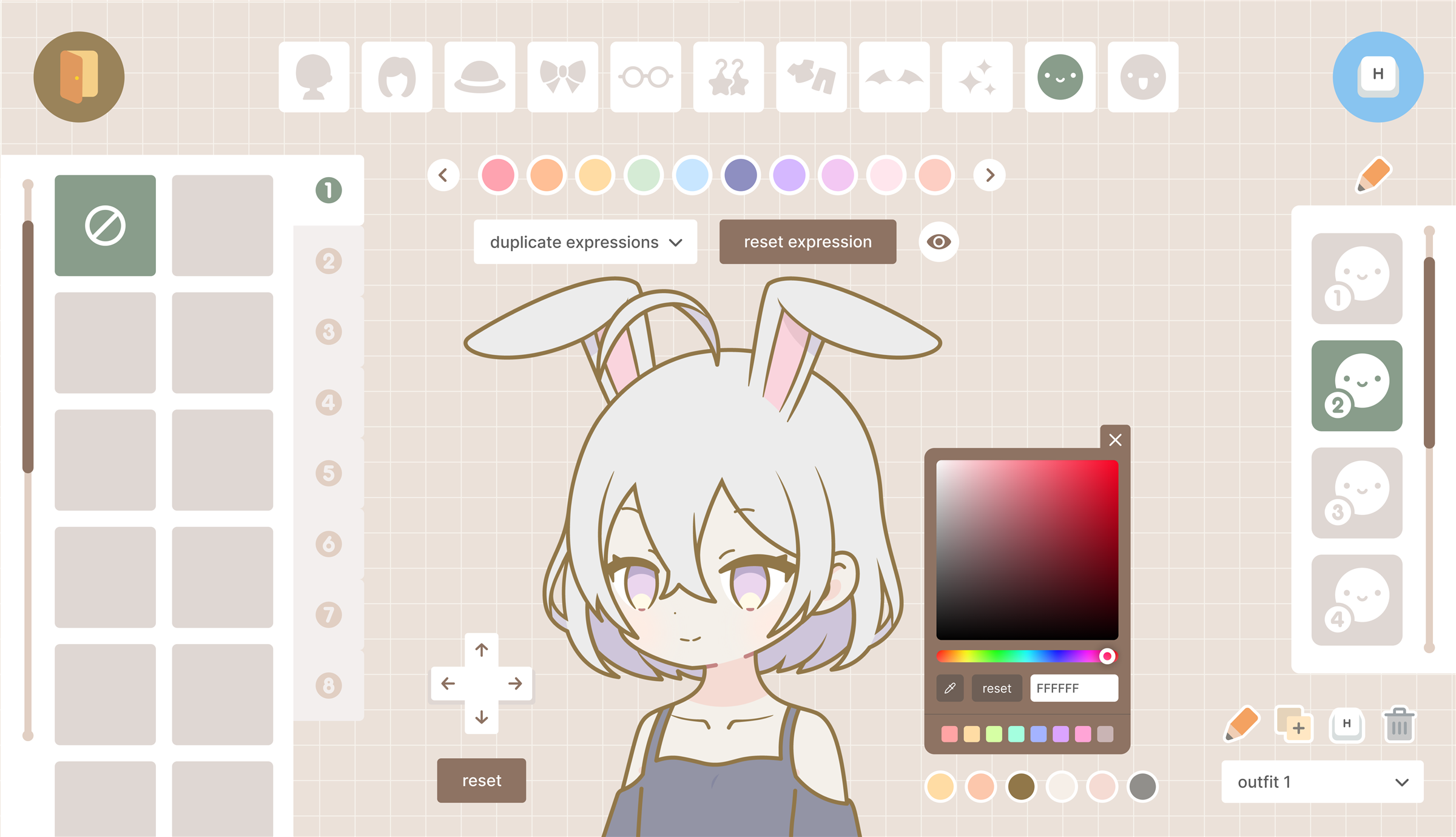
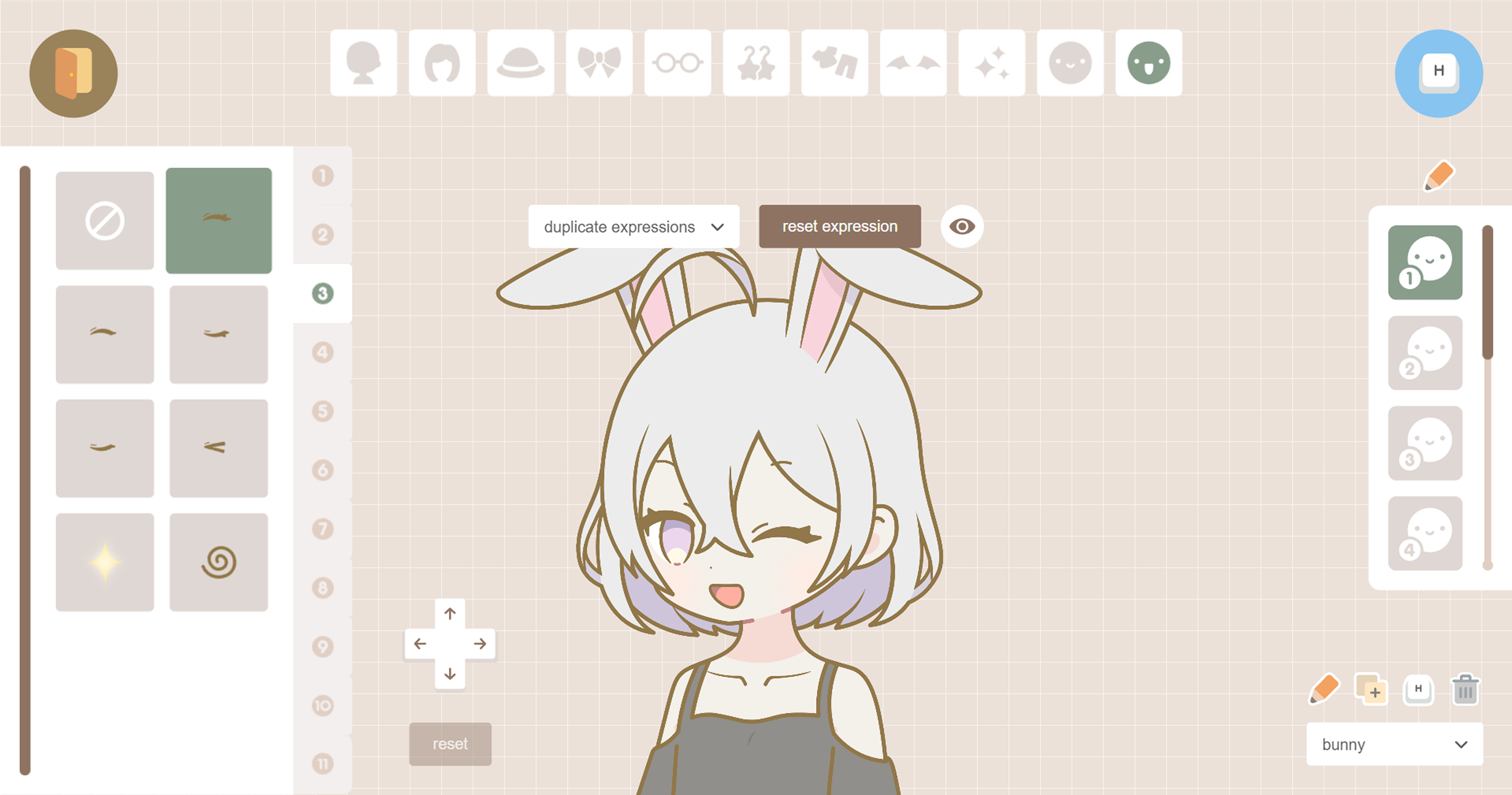
The wardrobe, where creators dress their avatar: a color picker, an item selector, a preset palette of quick colors, and item categories down the side.
Down at the control level, some refinements I made:
The trickiest was the face-tracking calibration icon. It had to communicate a complex idea, aligning your camera to your face, in a single glyph small enough to sit inline with the rest of the controls.

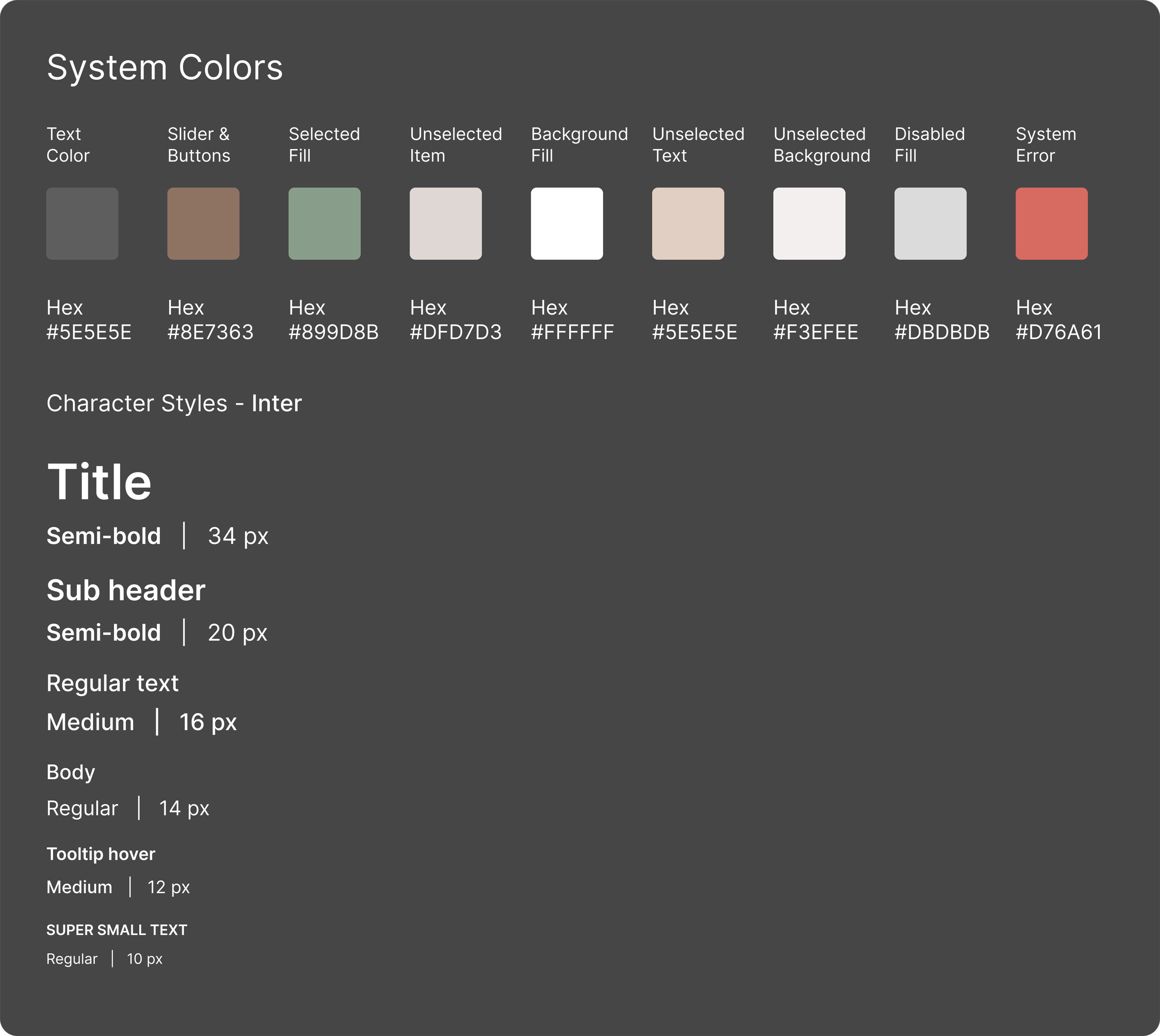
A consistent component system
Motion that communicates
Simplifying the interface also meant leaning on motion to guide the eye. I wanted real-time feedback, with assets and colors updating instantly, while keeping the experience clear without on-screen instructions.


Beyond the in-app UI motion, I moved into After Effects to build an animated logo and UI prompt, extending that motion language into the brand itself so Miniko feels modern and effortless to use.
Bringing Miniko to the web
Miniko's software is only half the story as I had also designed the site that sells it. The landing page has one job: turn a curious streamer into a download. I led with the avatars themselves, kept the path to download short, and carried the product's visual language straight through so the brand reads as one thing.
Impact
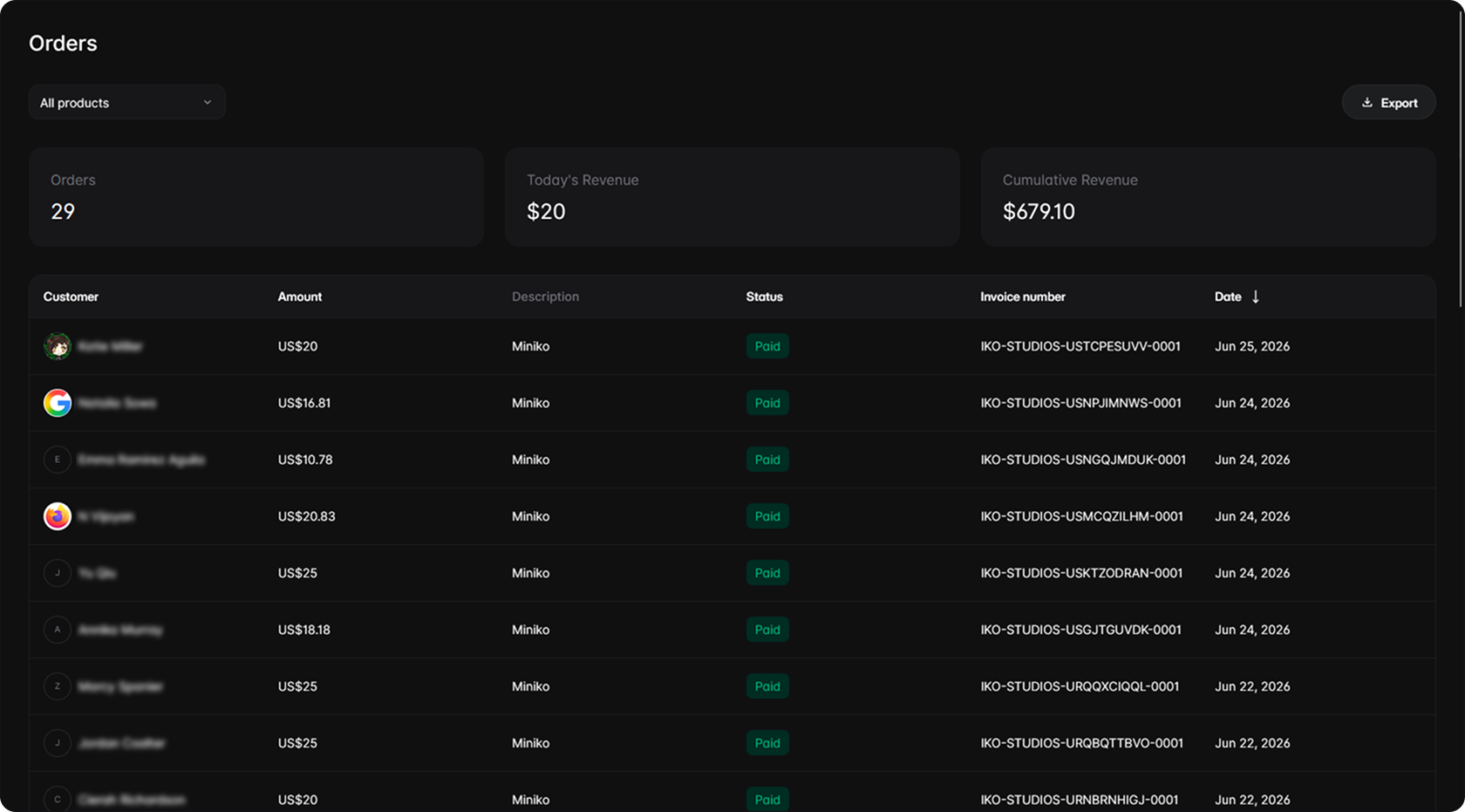
After finishing Miniko, I was finally able to launch it. That's when it hit me: Miniko isn't a prototype, it's a product strangers pay for. As of writing this case study, it has earned $679 across 29 paid orders, and it's still growing.
Reflection
Building Miniko made me an all-in-one researcher, designer, and front-end engineer. Unlike a corporate setting where there is friction and many pass-throughs for a small change, I was in complete control of the project. That freedom taught me a valuable lesson in how to cut scope hard, which in turn kept the creation flow simple for creators. Moving forward, I'll carry this lesson beyond Miniko, applying it to my career and every product I work on.