Glimpse Social is a mobile platform that gives independent and minority-owned businesses the same reach as big brands. As product designer I owned the experience from zero to launch, including research, core features, branding, and motion, scaling it to 2,000+ local business connections.
- Role
- Product Designer
- Timeline
- 2019 — 2022
- Tools
- XD, Illustrator, After Effects
Problem
The COVID-19 pandemic reshaped how customers shop and view entertainment, negatively impacting minority-owned, underserved, and independent businesses. These businesses struggle to gain visibility and increase foot traffic due to a lack of budgeting and media.
Research
User interviews conducted from a survey to get an insight into the preferences of NYC customers and business owners on social media applications.
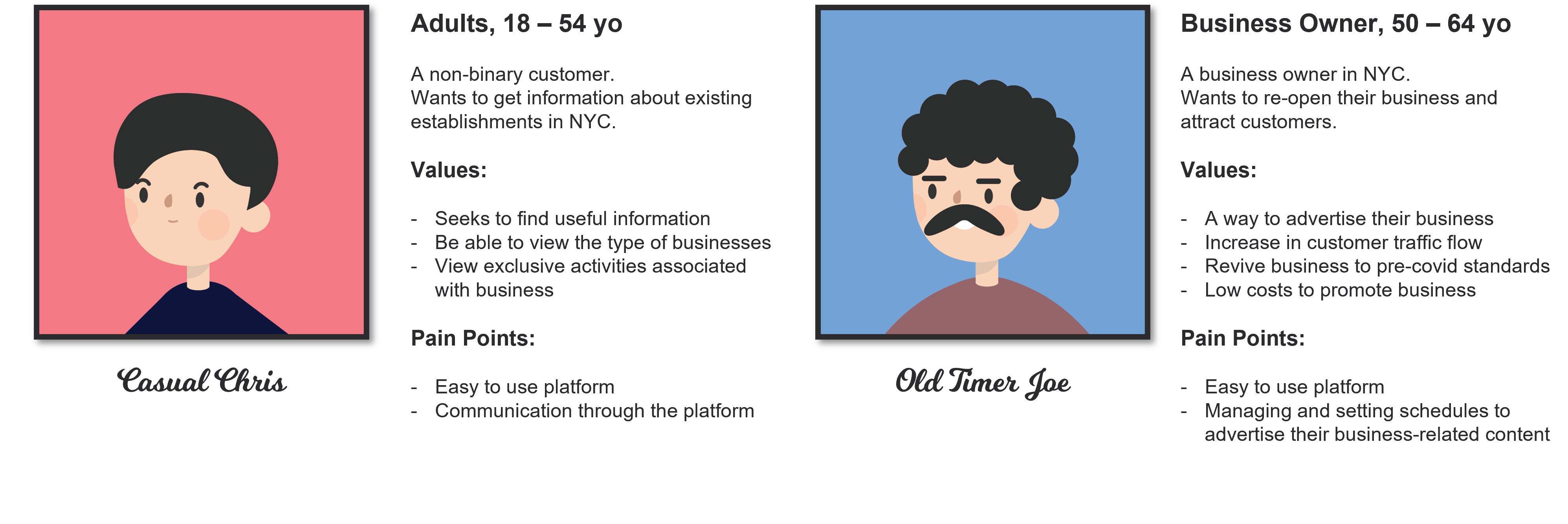
Personas for a customer and a business owner created from user interviews and online research. Used for prototyping and designing mock ups.
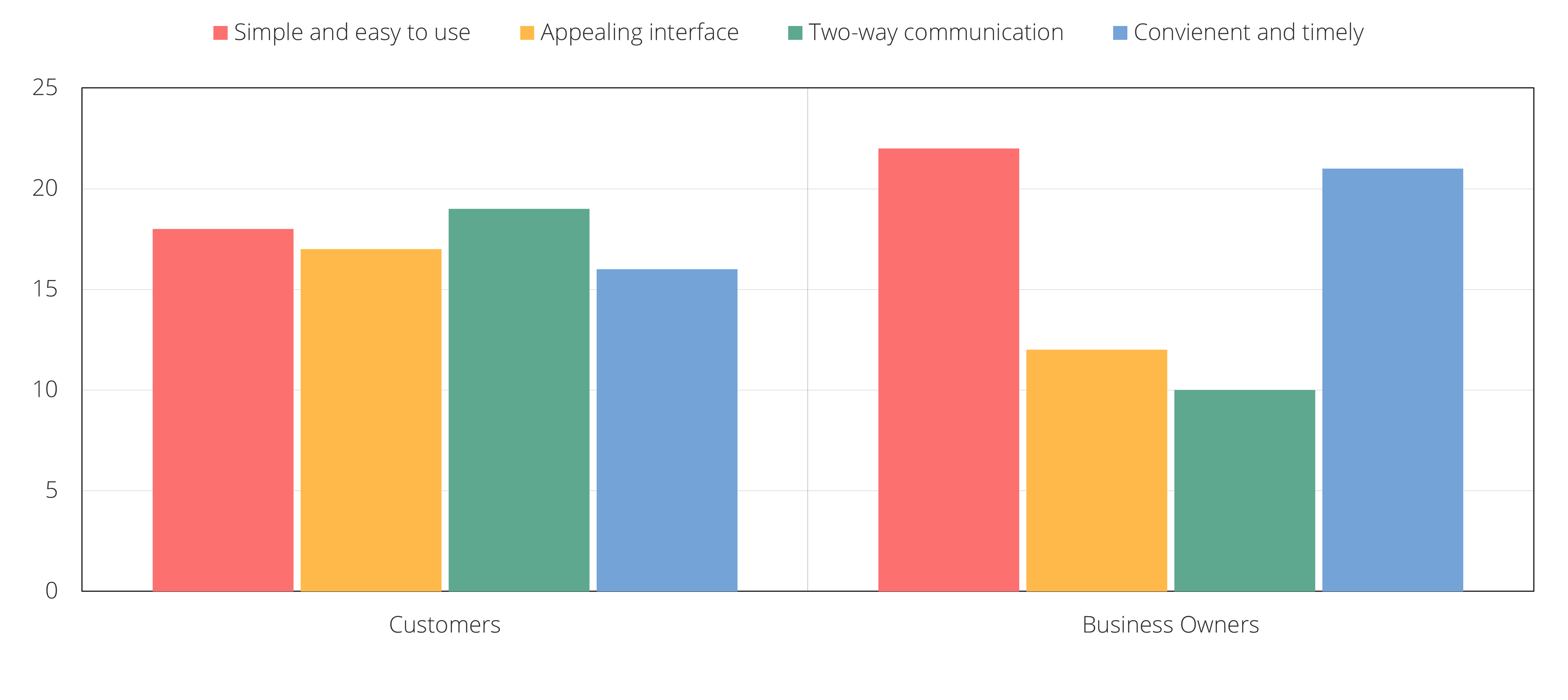
Key insights from research analysis
- Seamless two-way communication for both parties
- Integrate principles of material design for visual appeal, ensuring a high-quality experience
- Prioritize convenience and simplicity of features to ensure user-friendliness
Proposal
How can we design an experience to bring businesses to the same level of exposure as big competitors? What may entice customers to view local establishments and drive traffic to these businesses?
Design Process
Glimpse Social offers unlimited free advertising within the app and allows these businesses to push their updates to traditional social channels. For the first time, businesses of all types can collectively work together to raise their profile in the city and with potential customers, driving foot traffic when they need it.
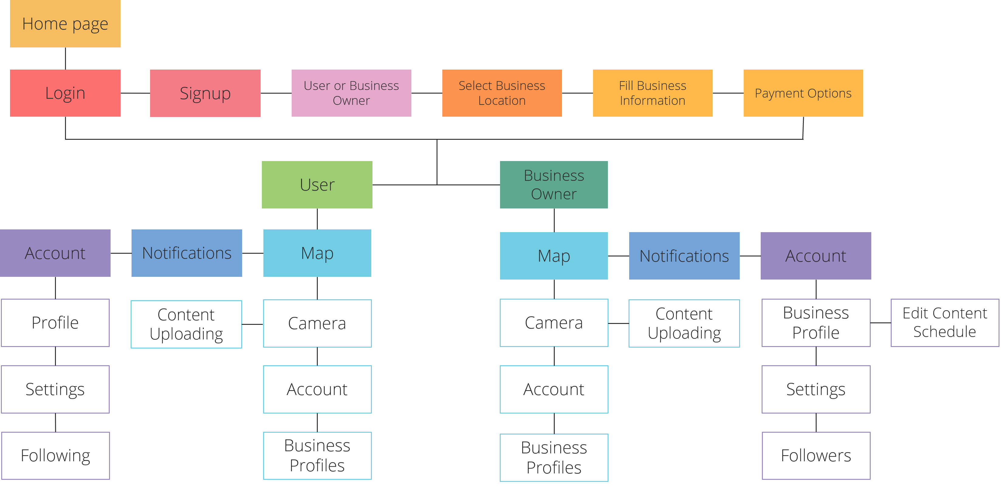
Sitemap to determine what features and pages would be valuable for users based on the research and ideation.
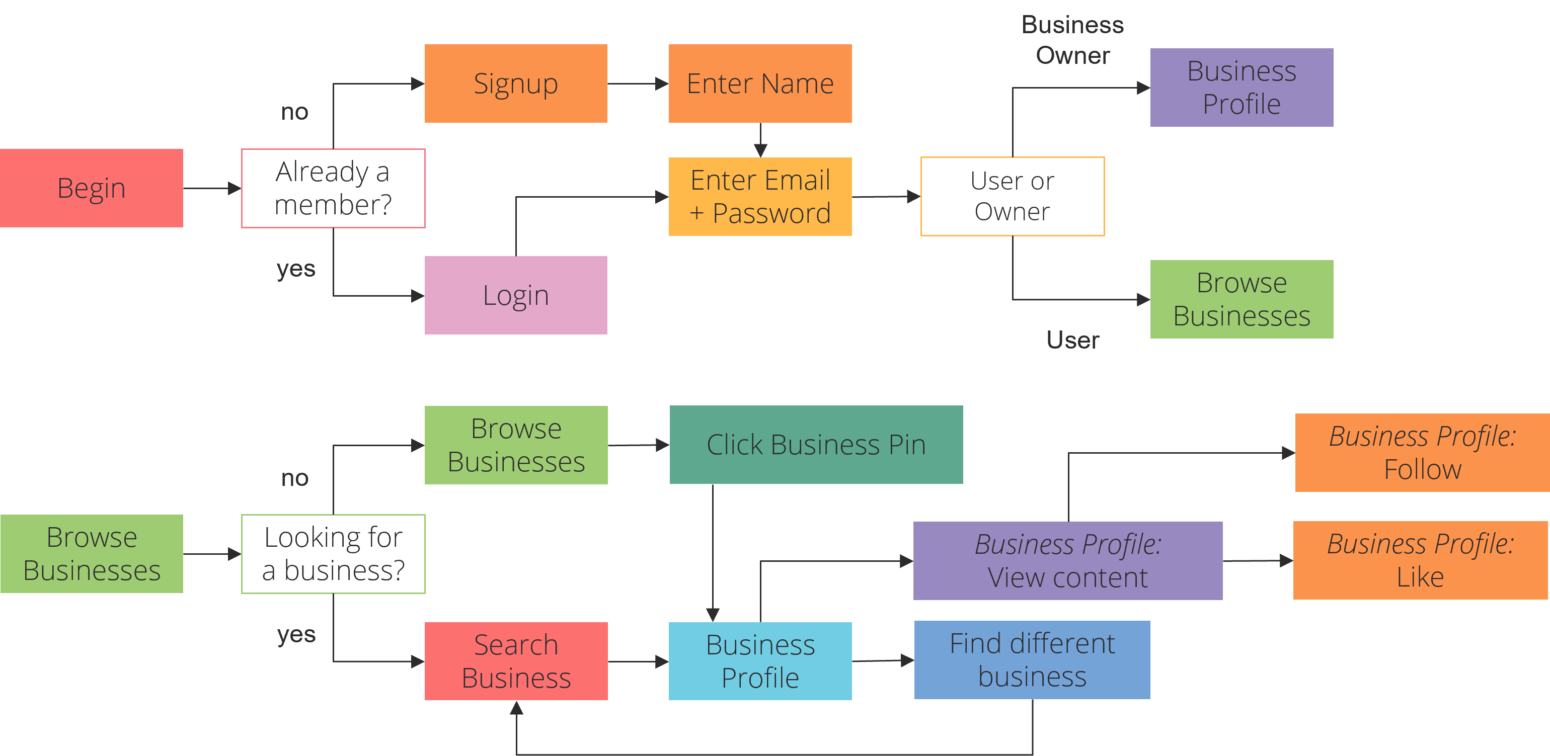
User flows designed to make sure the usability and available features were accessible and straightforward.
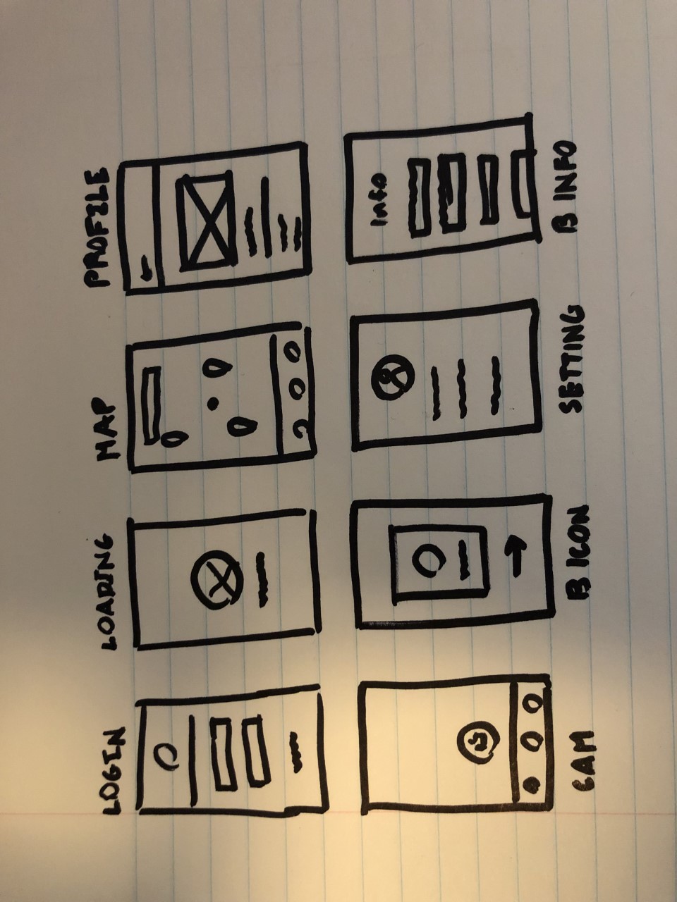


Ideation — early hand sketches mapping out every core screen before any pixels.
Design Decisions
Shadow Hierarchy
Using shadows to convey hierarchy to impact the prioritization of elements for users and solve usability issues.


Bold Colors and Whitespace
Utilizing bold colors to create meaning and focus for the user experience. Leveraged whitespace through typography and optimized text layout to emphasize key elements.


Motion Animations
Leveraged motion animation to guide user interactions and communicate functionality, enhancing the experience during processes like loading into the map interface.

Primary and Accent Colors
Optimizing visual clarity and design aesthetics by applying concise color schemes for backgrounds, fields, fonts, and key interface elements.

