Marketplace is a centralized hub where clinics discover, access, and integrate clinical-data applications, built at Smile CDR. As product designer, I took it from a blank page to launch: running user research and a brand strategy workshop, shaping the information architecture, and delivering a documented, responsive design.
- Role
- Product Designer
- Timeline
- 2022 — 2023
- Tools
- Figma, Illustrator
As the product designer on Marketplace, I led the project from its conceptual stage, working closely with product owners, QA, business analysts, a UX lead, and developers to take it from a blank page to a launched, responsive product.
Research
Understanding Marketplace
I started with user flows to grasp the project's scope and map its diverse user base, building a clear picture of every part of the application and what each kind of user needed from it.

Working closely with our product owners, I sharpened those needs into focused research questions, splitting the audience into two groups, buyers and sellers, so the design could speak directly to each.
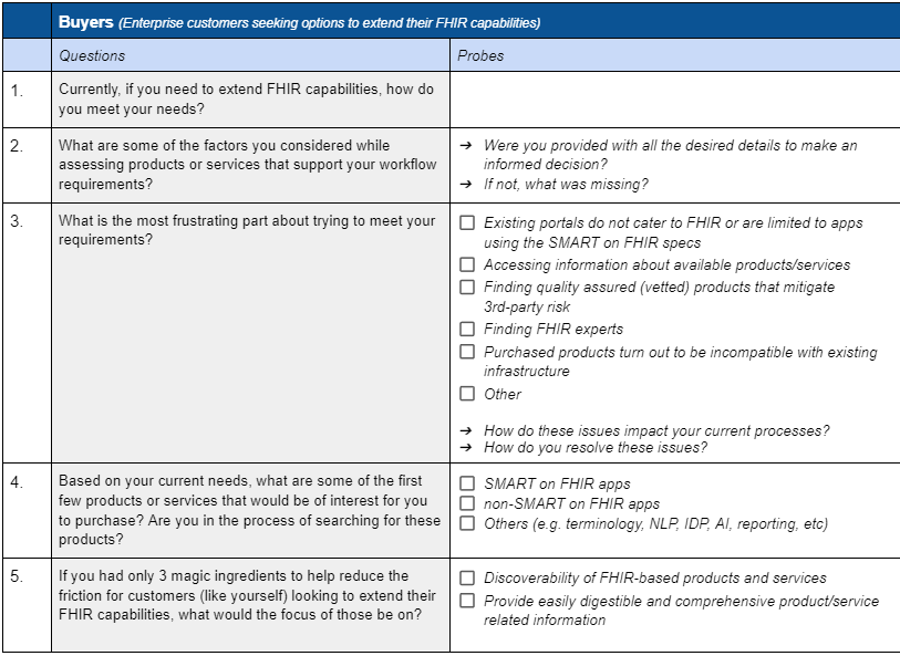
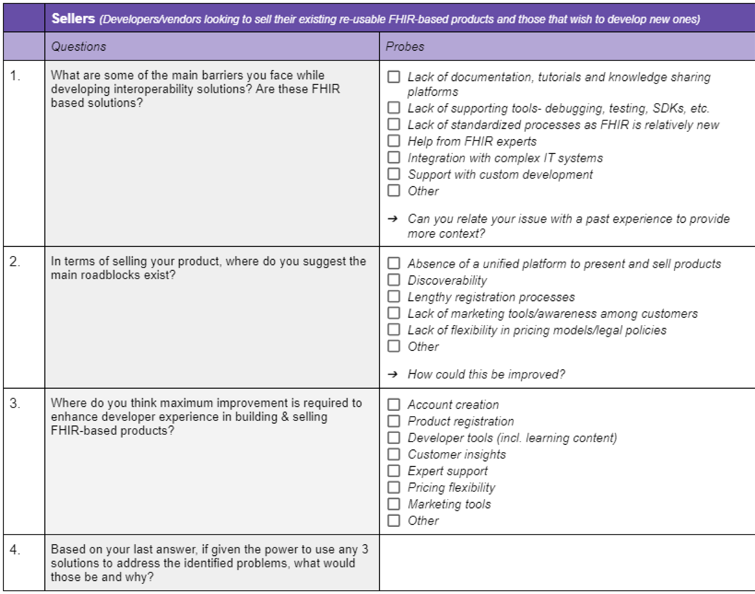
For buyers, I focused on doctors at private clinics for firsthand insight. For sellers, I interviewed representatives from B.Well, a company building clinical-data applications, to understand the other side of the marketplace.
Key insights from user interviews
- Users wanted a quick overview of an app up front, with fuller detail available when they chose to dig in.
- Categorization mattered, especially for sellers managing several applications at once.
- A fast, reliable search was essential for finding the right application without friction.
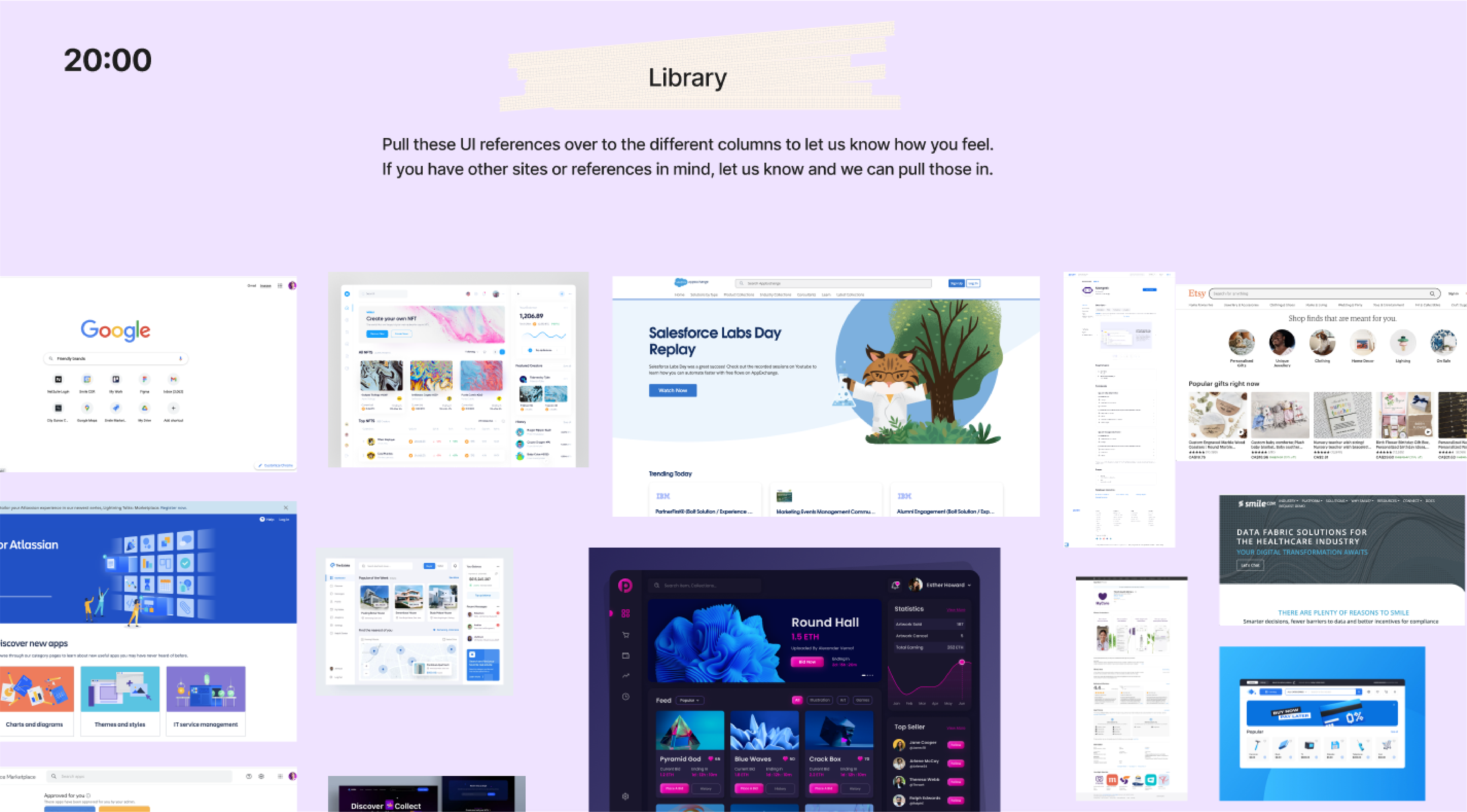
Alongside my UX lead, I ran a brand strategy workshop. Marketing, product owners, developers, and stakeholders all took part, shaping a shared sense of what the Marketplace brand should stand for.
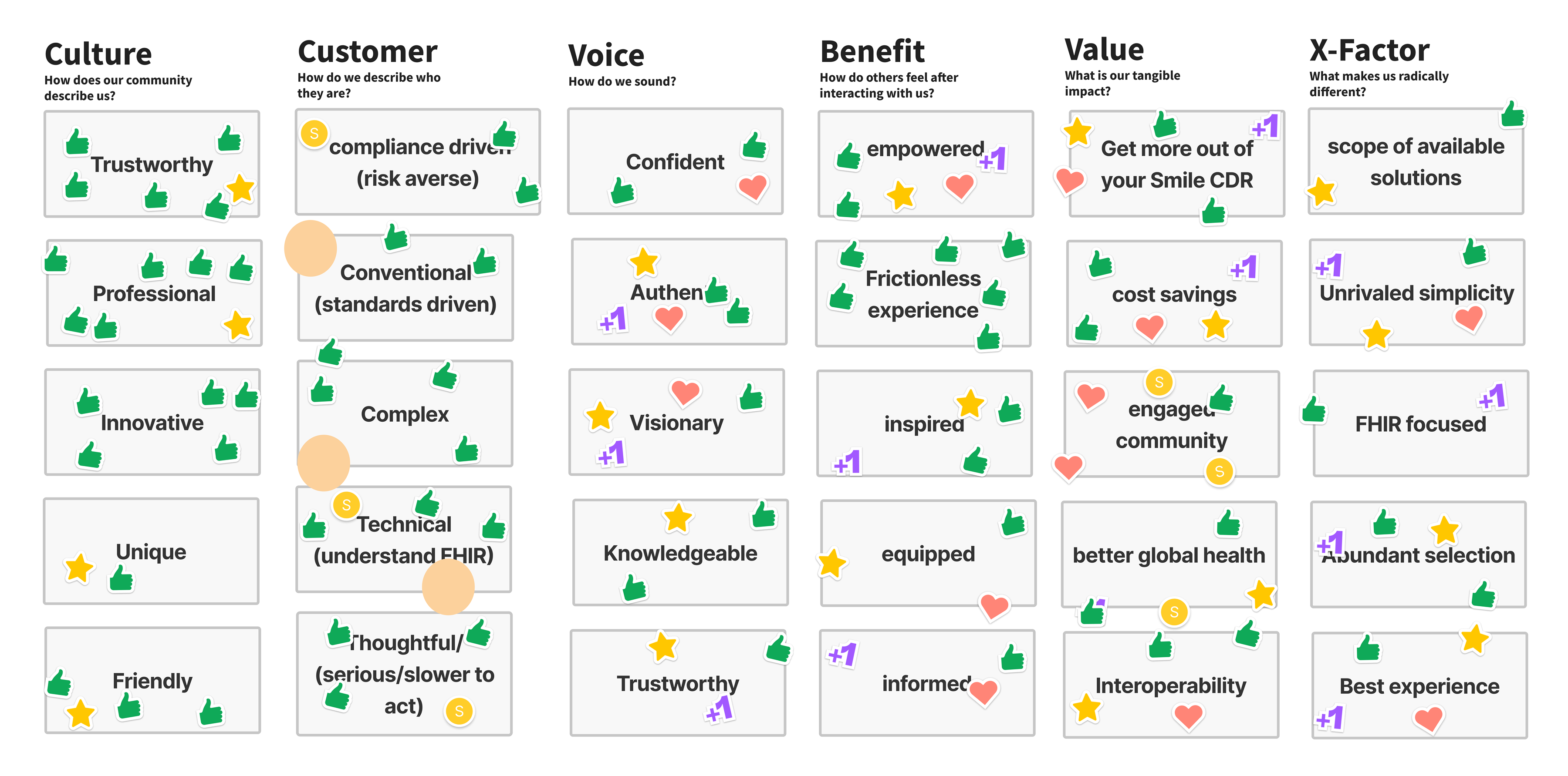
Key insights from the workshop
- Lead with a striking, reference-informed banner that captures the brand's essence.
- Keep the look minimal to convey professionalism and trust through simplicity.
- Prioritize a seamless, responsive experience that keeps users engaged across devices.
Design Process
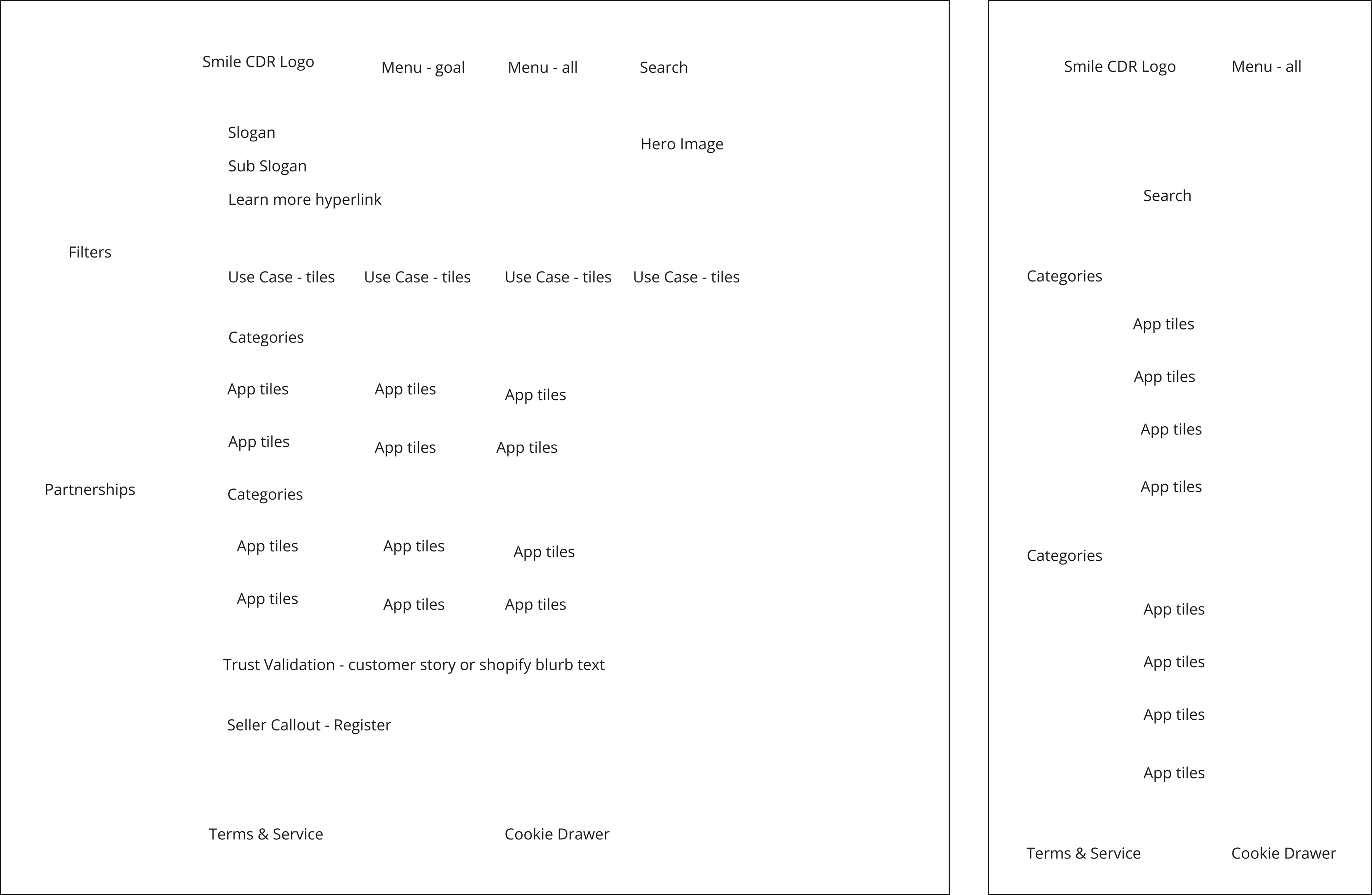
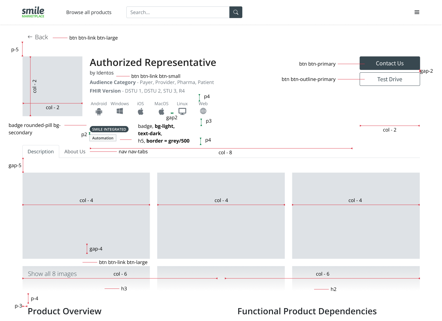
With the UX lead, I distilled everything from the interviews and workshop into a breadboard, mapping what each screen needed before any pixels, from search and categories to app tiles, partnerships, and trust signals.
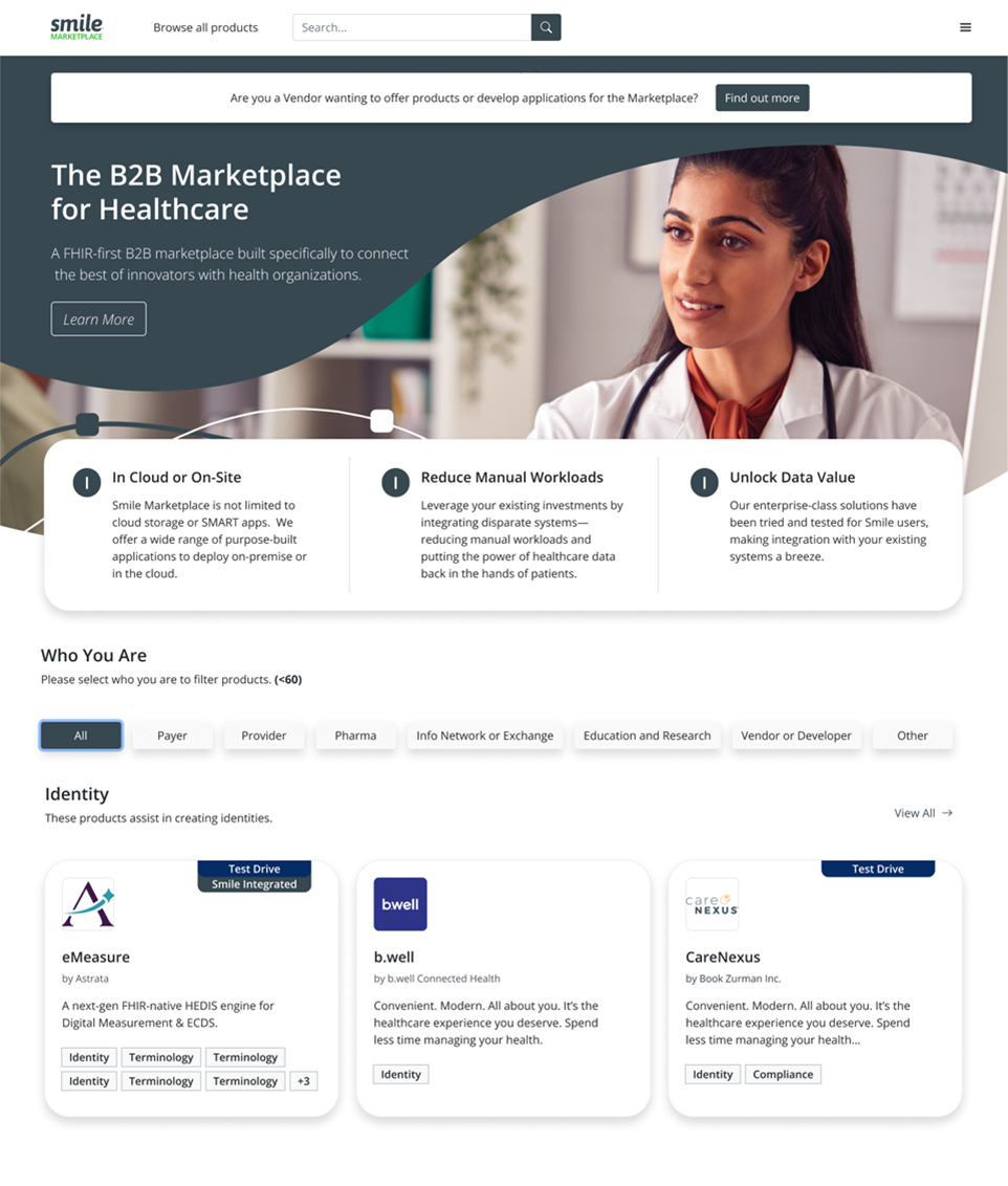
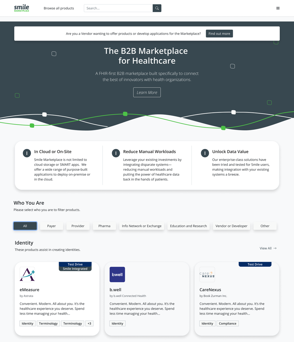
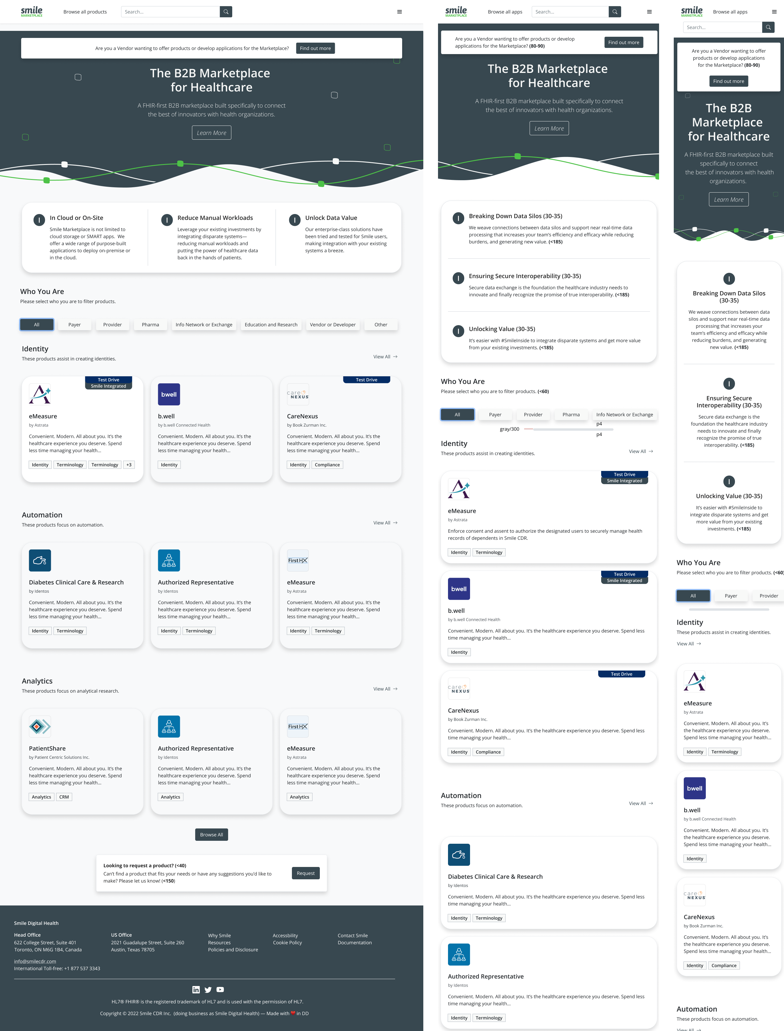
Iterations — refining the landing page from an early concept with a stock hero to a cleaner, more focused layout.